Adding Plots
It is helpful to make some plots of a few variables from the initial condition as a sanity check. We do this using the visualization for horizontal fields from planar meshes.
$ vim polaris/tasks/ocean/my_overflow/init.py
import cmocean  # noqa: F401
import numpy as np
import xarray as xr
from mpas_tools.io import write_netcdf
from mpas_tools.mesh.conversion import convert, cull
from mpas_tools.ocean.viz.transect import compute_transect, plot_transect
from mpas_tools.planar_hex import make_planar_hex_mesh

...

class Init(Step):

    ...

    def run(self):

        ...

        write_netcdf(ds, 'init.nc')

        x_min = ds_mesh.xVertex.min().values
        x_max = ds_mesh.xVertex.max().values
        y_mid = ds_mesh.yCell.median().values

        x = xr.DataArray(data=np.linspace(x_min, x_max, 2), dims=('nPoints',))
        y = y_mid * xr.ones_like(x)

        ds_transect = compute_transect(
            x=x,
            y=y,
            ds_horiz_mesh=ds_mesh,
            layer_thickness=ds.layerThickness.isel(Time=0),
            bottom_depth=ds.bottomDepth,
            min_level_cell=ds.minLevelCell - 1,
            max_level_cell=ds.maxLevelCell - 1,
            spherical=False,
        )

        field_name = 'temperature'
        plot_transect(
            ds_transect=ds_transect,
            mpas_field=ds[field_name].isel(Time=0),
            title=f'{field_name} at y={1e-3 * y_mid:.1f} km',
            out_filename=f'initial_{field_name}_section.png',
            cmap='cmo.thermal',
            interface_color='grey',
            colorbar_label=r'$^\circ$C',
        )
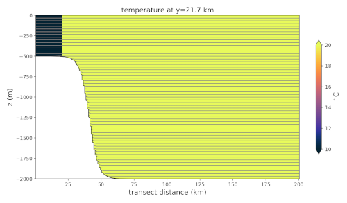
Overflow Initial Temperature
Here, we create a transect through the middle of the domain along the x direction. Then, we plot the temperature along the transect.
In the long run, it may be best to remove this plotting (overflow does not
include it) because it is a waste of computing time to make plots during
regression testing that no one will look at. But, during development, these
plots are an important sanity check that we have set up the initial condition
the way we expect.
Test the Plotting
Once again, repeat the testing procedure from
Testing the First Task and Step in a new work
directory. Now, you should see init/initial_temperature_section.png that
looks like shown to the right.